Cronn-Mills, K. 2000, ‘A visible ideology: a document series in a women’s clothing company’ in The Journal of Technical Writing and Communication, Vol. 30 (2) pp 125-141.
Floyd, E and Wilson, L. 1994, Advertising from the desktop, Ventana Press, Chapel Hill NC, pp 254-260.
Macnamara, L. 2006, Student newspapers feel the squeeze (Online, accessed 9 Aug. 2006).
URL: http://www.theaustralian.news.com.au/story/0,20867,20063451-7582,00.html
Nielsen, J. 1997, F-Shaped Pattern For Reading Web Content (Online, accessed 5 Aug. 2006).
URL: http://www.useit.com/alertbox/reading_pattern.html
Nielsen, J. 1997, How Users Read on the Web (Online, accessed 5 Aug. 2006).
URL: http://www.useit.com/alertbox/9710a.html
Sinclair, L. 2006, Advertisers prepare for online shift (Online, accessed 3 Aug. 2006).
URL: http://www.theaustralian.news.com.au/story/0,20867,19997697-7582,00.html
Sinclair, L. 2006, Research gives celebrities a star role (Online, accessed 3 Aug. 2006).
URL: http://www.theaustralian.news.com.au/story/0,20867,19921961-7582,00.html
Reep, DC. 1997, Technical writing: Principles, strategies and readings, 3rd edn, Allyn and Bacon, Boston, pp 90-128
Webb, M and Albers, MJ. 2001 ‘The design elements of medieval Books of Hours’ in The Journal of Technical Writing and Communication, Vol. 31 (4) pp 353-361.
Williams, R. (n.d.), Web design features (Online, accessed 5 Aug. 2006).
URL: http://www.ratz.com/features.html
Thursday, August 10, 2006
Wednesday, August 09, 2006
Insight
I have a personal blog serving as my online journal since last year. Thus, I am not new to the blogging environment. I thought this assignment will be fun and interesting as I enjoy blogging.
As I progressed, I realized that it is not easy to blog on serious topics. I am required to review and critique articles and websites that are related to document design. It requires critical thinking and a lot of extra effort in studying the articles. Previously, I use a lot of short forms and informal language in my personal blog. Since this is an assignment, I should show my professionalism as a degree student. The language used is more formal since the content has to be informative and educational.
Plenty of online researches were conducted in order to complete this assignment. I have learnt a lot more about the principles of good and bad document design. I am now more analytical and critical while surfing the internet. As a blogger, I can voice out my opinion and interact with people of the same interest over the internet. However, I do think that it is compulsory for all the bloggers to blog ethically.
Last but not least, do hope that everyone enjoy reading my weblog.
Article for Week 3
Student newspapers feel the squeeze
The article is dated August 9, 2006, written by Lisa Macnamara.
Importance of university newspapers
In my opinion, student newspaper is an essential platform for students to voice their point of views. Students may write in to college newspaper to comment about issues that affect them. It provides them a means to express what is in their mind. It can be used as a communication tool between students and the college’s management. It also serves as a medium to prove the students’ talent. They can apply knowledge and skills that have been learnt in class practically. It is important for them to experience what it is like in the journalism world before they start working. Understand how the industry work provides them an opportunity to acquire practical experiences that could not be found from text books.
Difficulties faced by student newspapers
A tight budget may affect the quality of the newspapers as the students could not perform as they please. Their creativity is restricted within a tiny frame. Some newspapers have to be published on an ad-hoc basis or circulation has to be reduced. Student newspapers which are dependent on advertisement financially may be unable to speak as they want. This is because the organizations that are funding the papers may affect the content. Content of the newspapers are sometimes exaggerated in order to please the advertisers. Issues that are sensitive to the organization are not allowed to be published. In this case, the newspaper loses its credibility.
Shift to the internet
I would like to suggest that student newspapers could be published online. The internet allows more interaction among the community. The editorial board could interact with the readers over the internet. Both parties can voice out their opinion freely and share related experiences. The newspapers will be more democratic as everyone is able to speak up their mind with no constraints. Publishing online is cheaper than printing it out since no paper and printing expenses are required. However, content in the online sector is difficult to censor. Irresponsible people may misuse the technology for their own benefit.
Article for Week 2
Advertisers prepare for online shift
The article is dated August 3, 2006, written by Lara Sinclair.
Major shift in media access
A few decades ago, people relied on the print media to obtain information. Later on, they shifted to the broadcast media when radios and televisions become common in every household. But now the trend is leading towards the era of accessing Internet and pay TV. In Malaysia, Astro, the leading pay TV station has more than 1.6 million subscribers nation wide, covering 31% of television homes.
The online sector is progressing massively. We can get almost everything from the internet: entertainment, news, lifestyle, friends, business, and now we can even shop online. All these factors support the growth of the online sector. Thus, advertisers focus more on the internet nowadays as the advertisements online could reach everyone throughout the world.
Piracy
The online sector brings plenty of convenience to our daily life but it brings disadvantages too. Piracy is one of the most significant issues. Video clips and music can be downloaded easily through the internet. There are websites that allow copyrighted materials to be downloaded for free. Laws are amended but it does not curb the issue instantly. In my opinion, everyone should be educated on knowledge regarding copyright and human rights since young. We must learn to respect others’ effort in producing their piece of artwork. We should also appreciate the advancement of technology but not misuse it.
The latest trend: collaboration among different media
Free-to-air TV stations in Malaysia are putting a lot of effort to attract more audience. For example, 8TV (a Malaysian free-to-air TV) has shown a few latest Korean dramas before the Astro (a pay TV) shows them. Some of the free-to-air channels (TV1, TV2, TV3, NTV7 and 8TV) can also be viewed in Astro. Besides that, most of the TV and radio stations come out with interactive contests that involve the access to broadcast media, online sector and mobile phones. These contests attract the younger generation who is keen on surfing the internet and using mobile phones. All mediums of media have been working closely to sustain each others’ survival.
Article for Week 1
Research gives celebrities a star role
The article is dated July 27, 2006, written by Lara Sinclair.
Demand for celebrity-centric magazines increase
There are more magazines of this genre serving the publics nowadays. The general public tends to be more curious about the celebrities. We want to know what the celebrities do in their spare time. Are they just like any of the ordinary men? In addition, we wish to ‘look’ like a star. Certain public are very much interested in the products worn by celebrities. They will look for all the products that they think fit the star they favored hoping that they will look good in it as well. According to research and strategy director, Mark Chesterfield, “our obsession with celebrities was a significant social shift rather than a passing fad.”
Media ethics should be applied
Reading celebrity-centric magazines is not an unhealthy habit if the media apply ethical views in writing news stories. As a reader, I strongly request for accurate and credible content. Magazines should not be used as a tool to manipulate readers. False and exaggerated information should be restricted. However, some recording companies misuse their mutual beneficial relationship with the media to send out misleading information about the celebrities. That is the one of the reasons that boosted paparazzi culture, especially in the print media. In my opinion, paparazzi culture should be abolished because what they do has already violated human rights and individual privacy.
Roles played by celebrity
Celebrities nowadays represent social conscience. Thus, they serve as role model to the masses. They should behave in an appropriate manner because how they response to issues will affect the publics. The way they speak or dress may have an impact to the social norms. Celebrities may also play their parts in educating their fans to perform a positive personality.
Website Critique
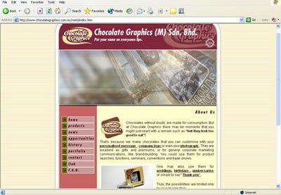
I have chosen to critique the official website of Chocolate Graphics (M) Sdn. Bhd.
The unification of a document is very important as the consistency guides the reader through the text at a pace that they feel comfortable with (Reep, 1997). The orientation of the website applies the ‘F’ reading pattern, with a header that consists of company's logo, name and an animation, a navigation bar at the left and body copy in the center of the page. This supports the statement made by Jakob Nielsen (1997), “users often read Web pages in an F-shaped pattern: two horizontal stripes followed by a vertical stripe”.
Williams (n.d.) says that a good design requires every web page in the site looks like it belongs to the same site; there are repetitive elements that carry throughout the pages. I agree that the website has repetitive elements which show that it belongs to the same site. For example, the background colour that is used in all the web pages is consistent. It clearly informs the readers that all the web pages belong to a same site. A sense of individuality was also added to the documents with the use of the same logo (Cronn-Mills, 2000). The corporate logo of Chocolate Graphics is shown in all the web pages to remind the readers that this website belongs to Chocolate Graphics.
Webb and Albers (2001) said that using black or brown ink on cream colored parchment created high visual contrast. The website uses brown coloured font typed on a beige background. It increases readability. Floyd and Wilson (1994) said that choose a typeface for body copy and one for a headline, and stick to these two typefaces throughout the text. The website uses only two typefaces, one for the main headlines, the other one is used for sub-headlines and body copy. The sub-headlines are in boldfaces and different shades to increase readability. Important points are also bold in different tone of brown colours. It creates visual cues throughout the text. All the colours that are used in the website are cheerful and vibrant tones, such as pink, light yellow, and beige. It supports the products they sell as chocolates are dessert that will make people happy.
According to Nielsen (1997), people rarely read Web pages word by word; instead, they scan the page, picking out individual words and sentences. Short and concise sentences attract the readers to continue reading your website. The sentences in the website are quite long. Readers may not have the patience to read the whole article and thus they may miss important information related to the organization. However, the body copy of Chocolate Graphics uses plain English which everyone could understand.
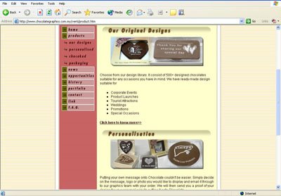
Floyd and Wilson (1994) said that interesting visuals are required to work with sale messages. The images of chocolates shown are related to the information that Chocolate Graphic wishes to convey. Thus, the use of graphics complements the sales messages. Webb and Albers (2001) stated that captions reinforce the relationship between the text and illustrations. Some pictures in the web pages do not have a caption. In my opinion, captions are essential to images in order to clarify the messages behind them.
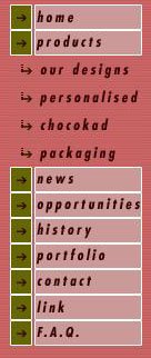
Williams (n.d.) said that useful navigation buttons and bars requires the following points,
* Easy to understand and use
* Consistent throughout web site
* Provide the visitor with a clue as to where they are, what page of the site they are currently on
The navigation bar in the website is consistent. The same navigation bar appears on the left of every web page. The navigation buttons are easy to understand and it clearly tells the readers which page they are reading at the mean time.
Nielsen (1997) said that credibility can be increased by high-quality graphics, good writing, and use of outbound hypertext links. Links to other sites show that the authors have done their homework and are not afraid to let readers visit other sites. I realized that some of the links in the homepage could not be reached. Chocolate Graphics should remove those links since they are not usable. However, the links provided in the navigational bar are related to the organization and useful to the readers. For example, Chocolate Graphics official websites in other countries are provided.
In conclusion, the website is considered good enough overall. But the design could be improvised.
A few suggestions from me:
* Remove links that are not working
* The FAQ page is too ‘crowded’, use spacing to increase readability
* Add captions to all visuals
* Sentences should be concise
Monday, August 07, 2006
Reading 9: Part 2
Advertising from the desktop
by Floyd, E and Wilson, L, 1994
by Floyd, E and Wilson, L, 1994
Flyers
Flyers are also known as circulars. There are two types of flyers that are used extensively.
The first type is used to promote special events. Guerilla marketing approach often uses this category of flyers. Visuals are insignificant in these flyers. Clear headline tells the audience the gist of the message and finally persuade them to visit a store instantly. Deadline should be set on the offer so that target publics respond to the offer at once. The second kind of flyer plays the role as a poster and has a longer lifespan. Eye-catching visuals are important to enhance sales messages and attract readers to display it.
Flyers are printed on low-cost paper in order to save budget. They are printed in bulk so that it could reach a large number of audiences. Flyers are usually designed based on the size of 8 ½ x 11 inches according to Floyd and Wilson (1994). Flyers circulate everywhere; they can be inserted in shopping bags, placed on counters, windshields and doorknobs… (Floyd, E & Wilson, L, 1994) Clear and simple headline is important in both types of flyers as it may lead readers to discover more about the offer.
I do agree with the author that flyers circulate everywhere. Hence it is important to include all relevant information in flyers to inform the mass what is happening in your store. Flyers are distributed on the street or being placed in mailbox. The person who receives the flyer may be not interested in it. Therefore, punchy headlines and attractive visuals play their roles to catch the attention of the readers.
Sunday, August 06, 2006
Reading 9: Part 1
Advertising from the desktop
by Floyd, E and Wilson, L, 1994
Brochures
Good and bad document designs affect the functions and effectiveness of a brochure.
The regular design is an 8 ½ x 11 inch pamphlet- style brochure (Floyd, E & Wilson, L, 1994). However, there are different sizes of brochures that are commonly used. It is advisable to design brochures that can be fit into standard-size envelopes since custom-made envelopes are expensive. Preprinted brochure shells save the trouble of creating template for brochures. Floyd and Wilson (1994) stated that brochures are designed to last at least a year. This would save budget and the money could be invested in other areas. According to Floyd & Wilson (1994), use only two typefaces throughout the document, one for body content and another for headline. Eye-catching and important information should be placed on the inside flap panel because that is a high-visibility spot. Clear and specific information is important to pitch targeted readers. Brochures are also used as a response tool with reply slips included in the one of the panels. (Floyd, E & Wilson, L, 1994)
In my opinion, standardize font type and font size is a significant element in designing brochures. Applying too many typefaces in a brochure or the use of inappropriate font type affects readability. Hence, the brochure fails to convey its message.
Placement of graphics and text is important as well. Too many visuals caused the brochures to be overloaded. Images have to be chosen carefully so that accurate information could be delivered to the target public.
A brochure’s design may have an impact to the impression of related organization. Thus, brochure serves as an important publicity tool.
Reading 2: Part 2
A visible ideology: a document series in a women's clothing company
The article was adapted from The Journal of technical Writing and Communication (Vol. 30, Pg 125-141). It was written by Kristin Cronn-Mills in 2000.
A study was conducted by Cronn-Mills to analyze the redesigned sales documents of a women clothing company, namely Weekenders. The documents studied in this article were from the Fall/Winter 1997 and the Spring/Summer 1998 seasons. These documents were chosen because major design shift was discovered. The sales documents layouts were changed from season to season. However, there was only a slight change in the content.
There are four significant sales documents that are being used by Weekenders Fashion Coordinators. There are the Fashion Facts (FF) Brochure, Wardrobe Profile (WP) Brochure, Suggestions for the Weekenders Hostess Brochure, and Recruiting Brochure.
The concept of ethos was used in designing the sales documents of Weekenders. According to Kostelnick and Robert (Cronn-Mills, 2000), to develop ethos within a document is to cultivate a sense of character or credibility that will appeal to the audience. It is believed that ethos influences the customers to purchase certain products because those products reflect their values.
Document design as Ethos
Butterfly is chosen to represent Weekenders. It is viewed as a symbol of growth and transformation. In the previous brochures, butterfly in the logo was just an outline. After the redesign, visuals of real butterflies were used in the logo. Butterfly is a significant symbol in all Weekenders’ sales documents. It unifies the series of documents as well as reveals Weekenders identity. When you notice butterfly logo in any of the documents, you’ll know it belongs to Weekenders.
Using butterflies to symbolize change and growth enhanced Weekenders feminist ethos. Weekenders’ main philosophy of being a company run by women to serve women is clearly revealed through its entire sales document.
Document content as Ethos
The redesigned documents made minor changes content wise. “I stories” were used as a convincing attempt to recruit more Fashion Coordinators. However, the “I stories” used in both old and new sales document were almost the same. In the old brochure, the “I stories” were placed at high visibility spot. They readers would not miss them. On the contrary, the “I stories” were moved to the back panel in the redesigned brochures. It is not visible unless you turn the brochure over. In addition, the text was set in a smaller font. The redesigned brochure fails to play its role as font size and document placement influence readability. It could also affect the company’s image as a whole.
Some of the content of “I stories” in the old brochures was not realistic. However, the erroneous content appears in the new brochures as well. The copywriter of the new brochures should amend all the inaccurate information to increase credibility of the content. This could also boost the confidence of the public towards the company.
Conclusion
Weekenders deals carefully with the term feminism as the company does not want to be isolated by others. Nevertheless, the feminist ethos developed by Weekenders is clearly seen through the design and content of its sales document.
Reading 2: Part 1
The design elements of medieval Books of Hours
The article is adapted from The Journal Of Technical Writing and Communication (Vol. 31, Pg 353-361). It is written by Mary Webb and Michael J. Albers in 2001.
Webb and Albers analyzed the principles of document design that was used in the Books of Hours and how they fit within the four design criteria (supertextual, extratextual, intratextual, and intertextual) that are recognized by C. Kostelnick and D. Roberts in 1998 (Webb & Albers, 2001). The Books of Hours was produced by William de Brailes in Oxford, England.
Supertextual
The Books of Hours were designed in tiny sizes so that it would be convenient to carry in hand. The wide margins allowed room for fingertips. Moreover, the use of black and brown ink on cream coloured parchment created high visual contrast. Different coloured inks were used throughout the text to indicate important points.
Extratextual
Latin was used. It is a language that all educated men could understand. The artists included images that were familiar to the readers, such as local flora and fauna, scenes of daily life, and mythical beasts to form means of personalization (Webb & Albers, 2001). Captions enhanced the messages which the visuals tend to convey.
Intertextual
Headings or chapters were bold to ease readers in looking for cues. The spacing was consistent as analysis showed that the white space ratio of 49.86 is a ratio that is almost matching to the 50 percent text to page recommended by modern designer, Thomas Pearsall (Webb & Albers, 2001). With all these principles of design being applied, Webb and Albers (2001) commented that the Books of Hours formed a modern template and served to create overall document cohesiveness.
Intratextual
One column format was used to improve readability. Consistent and large font size increased readability as well. Only few lines were placed in a page so that the text would not be overloaded. The organization of text in each page was designed for slow reading to aid the readers’ meditation on the text.
Conclusion
The Books of Hours had pleased the needs of their readers as the design was truly focused on readability and usability. It is user friendly as all the elements of design being applied ease the readers in making use of the manual frequently. The use of common acceptable and understandable visuals and language gives credit to this medieval manual as contextual cohesion was achieved. I do agree that the Books of Hours served as a high quality reference for future designers. Most of the criteria used can be applied in modern document publication. For example, the use of boldface to highlight headlines and chapters, the use of different colours to identify different points, standardize spacing and etc.
Friday, August 04, 2006
About the Author
I am currently a degree student from Taylor's College Petaling Jaya, Malaysia who is majoring in Communication and Media Management.
I enjoy reading fashion magazines, shopping, watching movies, playing PC games and swimming. I would like to be a wedding planner after I completed my studies.
I am the eldest daughter out of four siblings. I have a sister and two brothers. Both of my parents are businessman. My family loves eating and travelling.
Wednesday, August 02, 2006
Introduction
This weblog is one of my coursework for the subject Document design and Publication (DDP). This assignment enable us to acquire extra knowledge of document design elements as we are required to review and critique articles, websites and weblogs that are related to the course. In addition, we may apply all the skills and knowledge we learnt in the class to design the weblog.
I have chosen reading 2 and reading 9 from the course reader as my main readings.
Subscribe to:
Posts (Atom)
