I have chosen to critique the official website of Chocolate Graphics (M) Sdn. Bhd.
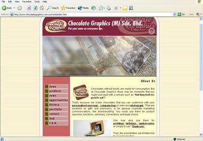
The unification of a document is very important as the consistency guides the reader through the text at a pace that they feel comfortable with (Reep, 1997). The orientation of the website applies the ‘F’ reading pattern, with a header that consists of company's logo, name and an animation, a navigation bar at the left and body copy in the center of the page. This supports the statement made by Jakob Nielsen (1997), “users often read Web pages in an F-shaped pattern: two horizontal stripes followed by a vertical stripe”.
Williams (n.d.) says that a good design requires every web page in the site looks like it belongs to the same site; there are repetitive elements that carry throughout the pages. I agree that the website has repetitive elements which show that it belongs to the same site. For example, the background colour that is used in all the web pages is consistent. It clearly informs the readers that all the web pages belong to a same site. A sense of individuality was also added to the documents with the use of the same logo (Cronn-Mills, 2000). The corporate logo of Chocolate Graphics is shown in all the web pages to remind the readers that this website belongs to Chocolate Graphics.
Webb and Albers (2001) said that using black or brown ink on cream colored parchment created high visual contrast. The website uses brown coloured font typed on a beige background. It increases readability. Floyd and Wilson (1994) said that choose a typeface for body copy and one for a headline, and stick to these two typefaces throughout the text. The website uses only two typefaces, one for the main headlines, the other one is used for sub-headlines and body copy. The sub-headlines are in boldfaces and different shades to increase readability. Important points are also bold in different tone of brown colours. It creates visual cues throughout the text. All the colours that are used in the website are cheerful and vibrant tones, such as pink, light yellow, and beige. It supports the products they sell as chocolates are dessert that will make people happy.
According to Nielsen (1997), people rarely read Web pages word by word; instead, they scan the page, picking out individual words and sentences. Short and concise sentences attract the readers to continue reading your website. The sentences in the website are quite long. Readers may not have the patience to read the whole article and thus they may miss important information related to the organization. However, the body copy of Chocolate Graphics uses plain English which everyone could understand.
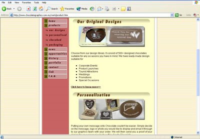
Floyd and Wilson (1994) said that interesting visuals are required to work with sale messages. The images of chocolates shown are related to the information that Chocolate Graphic wishes to convey. Thus, the use of graphics complements the sales messages. Webb and Albers (2001) stated that captions reinforce the relationship between the text and illustrations. Some pictures in the web pages do not have a caption. In my opinion, captions are essential to images in order to clarify the messages behind them.
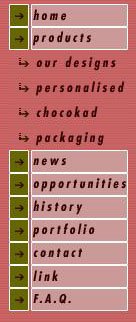
Williams (n.d.) said that useful navigation buttons and bars requires the following points,
* Easy to understand and use
* Consistent throughout web site
* Provide the visitor with a clue as to where they are, what page of the site they are currently on
The navigation bar in the website is consistent. The same navigation bar appears on the left of every web page. The navigation buttons are easy to understand and it clearly tells the readers which page they are reading at the mean time.
Nielsen (1997) said that credibility can be increased by high-quality graphics, good writing, and use of outbound hypertext links. Links to other sites show that the authors have done their homework and are not afraid to let readers visit other sites. I realized that some of the links in the homepage could not be reached. Chocolate Graphics should remove those links since they are not usable. However, the links provided in the navigational bar are related to the organization and useful to the readers. For example, Chocolate Graphics official websites in other countries are provided.
In conclusion, the website is considered good enough overall. But the design could be improvised.
A few suggestions from me:
* Remove links that are not working
* The FAQ page is too ‘crowded’, use spacing to increase readability
* Add captions to all visuals
* Sentences should be concise

No comments:
Post a Comment